Reporting & Analysis
Mar 24, 2023
TLDR
Looker Studio is a business intelligence and data visualization tool. By connecting data sources, you can create real-time reports. To do this, connect your data sources to Airboxr, run data analyses (Hops) in Google Sheets, and connect your Google Sheet to Looker Studio. Schedule your report's updates, share it with your team, and benefit from time savings, accurate data, and improved collaboration.
As an ecommerce marketing manager, you understand the importance of having accurate and up-to-date data at your fingertips, especially to be able to present the results of your marketing efforts to your management team. While there are many powerful business intelligence tools on the market, you may not have access to them, and so must find another way to create reports and data visualizations for internal reporting.
This is where Google's Looker Studio comes in. Looker Studio is a free business intelligence and data visualization platform that can help you make data-driven decisions. It combines two previously well known Google products, Looker and Google Data Studio.
One of the key features of Looker Studio is the ability to create reports that update automatically. This means that you can have the most recent data at your disposal without having to manually refresh your reports.
Here's how reports can look like in Looker Studio:


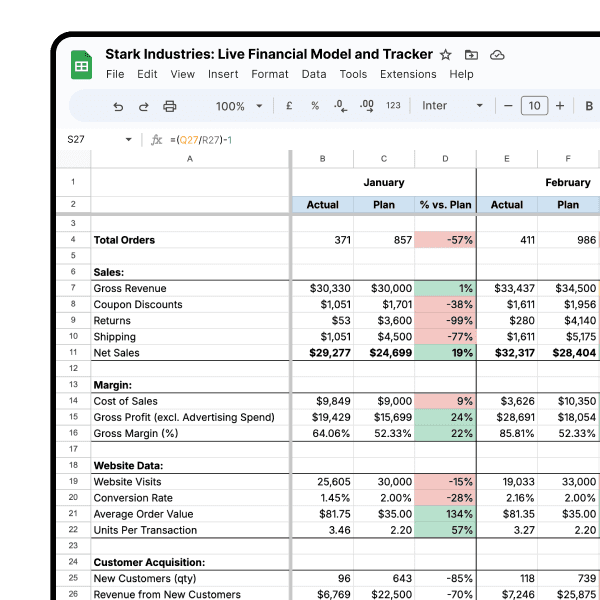
A report like this would be built off a spreadsheet working behind the scenes, which looks like this:

To create data visualizations that update automatically, you need two things: connectors, and data freshness.
What are data connectors?
Data connectors are software components that allow different applications to connect and communicate with each other, enabling data to be transferred between them. In the context of Looker Studio, data connectors are used to connect to various data sources and retrieve data for analysis and visualization.
When creating a new Looker Studio report, you will be prompted to add data to your report. Google offers 23 native connectors, such as Google Analytics, Google Ads, and Google Sheets.

For data sources that are part of the Google ecosystem, such as Google Ads and Google Analytics, it's very easy to connect to Looker Studio. For other data sources, such as Shopify, Facebook Ads, TikTok Ads, or Klaviyo, you need another method.
How do you connect Shopify, Facebook Ads, TikTok Ads, or Klaviyo to Looker Studio?
The best way to get this data into Looker Studio is to import them into Google Sheets. This is the easiest, most straightforward way to connect multiple data sources to Looker Studio, which also allows you the flexibility of working on spreadsheets.
Airboxr connects your data sources to Google Sheets easily. You can connect to your various sources from the Integrations page.

Once this is done, you can start importing data from these sources into Google Sheets using Airboxr's one-click analyses (also known as Hops).
How do you ensure data freshness?
There are several ways to ensure data freshness in Google Looker Studio:
Schedule data updates
You can schedule regular updates for your data to ensure that it remains fresh and up-to-date. This can be done by creating a schedule using Looker's scheduler, or by setting up a data pipeline (e.g. with Airboxr) to automatically update your data.
Configure cache settings
Looker Studio allows you to configure cache settings to optimize query performance and ensure that you are not querying outdated cached data. By setting cache expiration times and refreshing policies, you can ensure that your queries always return the most recent data.
Monitor data freshness
You can also monitor your data freshness by doing periodic checks every month or every quarter. This will help to catch any issues that may have surfaced over time due to changes to your data scheduling setup. If you need to do a manual refresh, you can use the refresh data button on Looker itself (click on the three dots menu at the top right of your Looker report).
By utilizing these methods, you can ensure that your data is always fresh and up-to-date in Google Looker Studio.
Steps to create real time reports in Looker Studio
We’ll show you how to create reports in Looker Studio that update automatically, using Airboxr.
Step 1: Connect your data sources to Airboxr
The first thing you'll want to do is make sure all your data sources are connected to the Airboxr app. Sign in with your Google Account, then go to the Integrations page and set up the connections. The process is very easy and takes just a couple of minutes to connect everything.

Step 2: Run a Hop
Say for example you want to create a graph showing sales data.
There are many sales Hops available on Airboxr. You can explore them on the Hops Marketplace.

For this example, we'll use the Sales vs. Marketing Spend over Time Hop.
Select the Hop, and then select the time period you want the report for. Run the Hop on a new sheet.

Your data will show up on your worksheet, like this. Remember to rename your Google Sheet!

Perfect! Now it's time to connect this sheet to Looker.
Step 3: Connect your Google Sheet to Looker Studio
Go to Looker Studio and create a new report. You will be prompted to connect to a data source; select Google Sheets.
From there, you will be able to select from a list of Google Sheets you already have. You can also type in the name of the spreadsheet to find it. Then, you'll be prompted to select the name of the worksheet you want to connect.
Here's how it looks:

Once your worksheet has been added as a data source, you will see something like this:

Step 3: Create a graph or chart
Now you can start creating graphs and charts with your data.
From the menu bar, select Add a chart. We've selected a smoothed line series chart.

The date range dimension will be set to Date by default. For your metrics, select Daily Total Spent and Sales. This will allow you to compare your daily total ad spend to sales.

The chart will look something like this:

Improve your DTC game. Sign up for weekly tips.
If you want your chart to show only a specific date range, you can add a filter. For example, we're creating a filter below that shows data only for the month of March.

That's it! Your chart will show sales vs. total ad spend for the month of March.
To show sales goals and KPIs on your dashboard, you can also use a gauge. Create a gauge chart, then go to Style, show axis, and set the min and max of the axis to the KPIs according to your business goals.

Step 4: Schedule your report
Now that you’ve created your dashboard, it’s time to schedule your report.
Go back to Airboxr to the worksheet where your ran your Hop. On the same sheet, select the Schedule button on the Hop to run it again on the same sheet.

Once it runs, you can set the schedule. Since this is a daily report, we suggest running it once a day.

If you want to receive an email notification for when your Hop runs, remember to select the checkbox for it. This will send you an email with a button that lets you open the spreadsheet and see your report directly.

That's it! Since you're running the Hop for the month to date, the Hop will automatically update every day with an extra row per day until the end of the month.
Step 5: Share Your Report
Once your report has been scheduled, you can share it with your team. Looker Studio allows you to share reports via email, link, or embedded on a website.
To share your report, go to the “Share” tab in your Dashboard and select the sharing method you prefer. You can also specify who you want to share your report with and the level of access they have.
Benefits of Creating Reports in Looker Studio that Update Automatically
Creating reports in Looker Studio that update automatically has several benefits for ecommerce marketing managers:
Saves Time: With reports that update automatically, you don’t have to spend time manually refreshing your data. This means that you can focus on analyzing your data and making data-driven decisions.
Accurate Data: Having reports running on schedule means you’re always working with the most up-to-date data, so that you can make your decisions based on accurate data.
Improved Collaboration: Since the data is always fresh, you and your team can work with the most up-to-date data, making collaboration smoother and easier to manage.
Creating reports in Looker Studio that update automatically is a great way for ecommerce marketing managers to access accurate and up-to-date data. By following the steps outlined in this article, you can create reports that update automatically and save time, work with accurate data, and improve collaboration with your team.
Looking for more tutorials? Check out these articles:
How to set up ad reports on Looker that update automatically
How to set up a product sales report on Looker that updates automatically
Want some help setting up? Reach out to us on the in-app chat to schedule a call.