Reporting & Analysis
May 12, 2022
TLDR
You can easily create data visualizations from your data analysis in Airboxr by using Google Data Studio. First, connect Google Data Studio to Google Sheets, select your data source, configure data source options, and connect. Then, create your report in Google Data Studio to generate charts and graphs based on your data. Additionally, you can schedule data analysis in Airboxr to automatically update your graphs and charts in Google Data Studio at specific times.
Data analysis often goes hand in hand with data visualization. There will be times when you need to see a visual representation of your data, either for reporting purposes, or to better see for yourself how your business is trending. Here’s the good news - as Airboxr works on Google Sheets, you can easily set up data visualizations from your data analysis by using Airboxr with Google Data Studio. Here’s how.
Step One: Connect Google Data Studio to Google Sheets
On the top left hand corner of Google Data Studio, click Create, then select Data Source.

Select the Google Sheets connector.

You may need to authorize your connection before you can use it.
Step Two: Select your data source
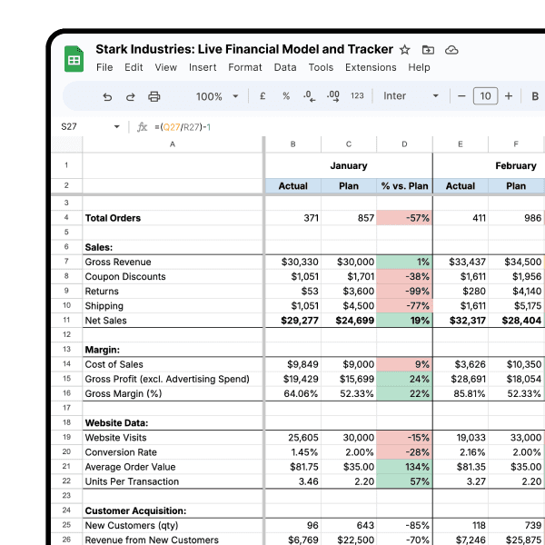
From here, you can select a spreadsheet (file), and worksheet (page within the file) to use as a data source.
You can select spreadsheets which are owned by you or that have been shared with you. You can also paste in the URL of a Google Sheet which you have access to, as seen below:

Step Three: Configure data source options
Keep the boxes checked if they apply; otherwise, uncheck them.


Step Four: Connect
Once you’re satisfied, click Connect. Then, you will be brought to this page showing your data source. Your data is ready to be used in graphical representations.

Step Five: Create Report
Click on the Create Report button on the top right hand corner. You will be taken to another page where you will be able to create charts and graphs using your data.

And that’s it! 🎉 Now you can easily create beautiful visualizations of your data analysis and insights.
Improve your DTC game. Sign up for weekly tips.
Bonus: Schedule your analysis for automatically updated graphs
With the Airboxr app, you can run data analysis and schedule them so they run automatically. Here’s how you do it:
Log in to the Airboxr app - get your invitation to our private beta (Shopify stores only)
Go to the Hops Marketplace.
Select the Hop ‘Ad Performance by Date’. Click ‘Add to My Hops’.

4. Go to My Sheets and create a new spreadsheet. Your Hop will show on the left sidebar; select it, then click Schedule.

5. Select location where you want the data to be shown. Click Next.

6. Select time frame for your schedule. Click Schedule Hop.

7. Link your spreadsheet with the scheduled Hop to Google Data Studio and create your required graphs and charts.
That’s all! Your sheet will update at the time you selected, and so will the graphs and charts in Google Data Studio.
Also read: Graphic design trends in data visualization for 2022