Reporting & Analysis
29.07.2022
TLDR
Cohort analysis categorizes customers by specific traits (e.g., acquisition month) and tracks their behavior over time (e.g., how many continue to purchase in subsequent months). You can create such reports manually or with tools like Google Analytics. Airboxr offers a convenient Cohort Analysis Hop that automates the process using Shopify data. This matrix helps you visualize customer retention trends, aiding in marketing strategies and re-engagement campaigns.
Acquiring customers takes effort. Measuring their retention is key for online store success, including Shopify stores. Existing customers provide steady revenue and lower acquisition costs. Cohort analysis is vital for tracking customer behavior and retention rates in Shopify stores. This article is a guide to cohort analysis insight and decision making.
Cohort Analysis Explained
In e-commerce, a cohort analysis report is typically used to measure groups of customers who have been acquired in the same month. It tracks common characteristics such as purchases and retention, offering insights into different cohorts' behavior and your retention strategies' success. Cohort analysis charts typically look like a matrix with cohorts listed on the first column and their future behavior across additional columns.
Customer Retention Measurement's Importance
It's essential to measure customer retention in Shopify stores. This reveals the effectiveness of your marketing and product strategies in maintaining customer engagement. Tracking retention metrics highlights areas for improvement, aiding in increasing customer loyalty and revenue.
Cohort Analysis Benefits for Retention Measurement
Cohort analysis tracks customer groups over time, comparing different cohorts' retention and purchasing patterns. Cohort analysis helps reveal trends and optimizes marketing and retention strategies, enhancing customer loyalty.
In ecommerce, we conduct cohort analysis to evaluate marketing campaigns, customer segments, and product changes on retention. Analyzing different cohorts' behavior and retention rates helps in refining marketing tactics and improving customer experiences.
One of the ways to analyze if your customers are staying with you, and coming back to shop repeatedly is by looking at retention cohorts. It looks like a matrix, and gives you a quick overview of:
Your customer ‘cohorts’ by the month they were acquired, and
What percentage of them stayed on and shopped with you again one month later, two months later, and so on?
Cohort analysis is a report that you want to track over the long term, say over 6 months or 12 months. It helps you to assess whether or not you need to reach out to your customers to re-engage them and re-ignite their interest in your store.
How to create a cohort analysis
There are many ways to do a cohort analysis using data analytics tools. You can create cohort analysis in:
Google Analytics,
Shopify, or
Airboxr.
1) Creating a report in Google Analytics
If you’re the building sort, you can use Google Analytics to build your cohort analysis charts and reports. Google gives detailed instructions on how to do that.
By building your own report, you can determine:
The cohort type (e.g. customers acquired)
The cohort size (e.g. acquisition by day, week, or month)
The metric you want to evaluate (e.g. whether they make a repeat purchase)
The relative date range and number of cohorts
Which cohorts are illustrated in the report
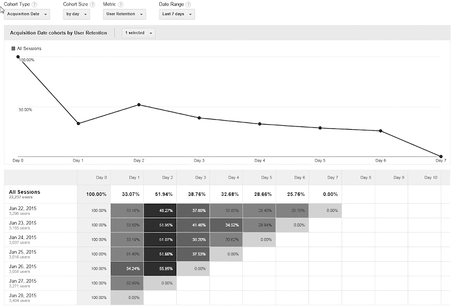
However, most Shopify stores tend to use Shopify sales data in their behavioral analytics reporting. This is because Google Analytics provides data on user behavior from your visitor cohorts, not customer cohorts. Here is a cohort analysis example you can find on Google Analytics.
If you’re looking for customer cohorts, the next two methods would be more relevant.
2) Manually keeping track of customers in Shopify
There doesn’t seem to be any way of creating a customer cohort analysis within Shopify itself. However, if you’re looking to assess the effectiveness of your acquisition efforts in April, you can find a list of people who placed orders from your store in April, then check each one to see when their previous orders were to get a sense of your customer retention rate for that month.

3) Using Airboxr’s automation platform for acquisition cohort analysis
Airboxr’s Cohort Analysis Hop automatically creates an acquisition cohort analysis matrix for you based on your Shopify data.
Once you add the Cohort Analysis Hop from the Hop Marketplace, you can already run it on a spreadsheet. This analysis is conducted for the last 6 months. Below is a demo of how your cohort data report looks like when you run the Hop:
Airboxr allows you to create a cohort analysis of your Shopify customers with a single click. Learn more about how it works and sign up for a free account.
How to read a cohort analysis
As shown above, the data is presented in matrix form. Next we will look at how to read the data in the matrix.
Usually, the rows of the matrix will show the month of customer acquisition, and the columns will show each subsequent month following the acquisition month, with Month 0 (aka M0) being the acquisition month. You can see it in the example screenshot below.
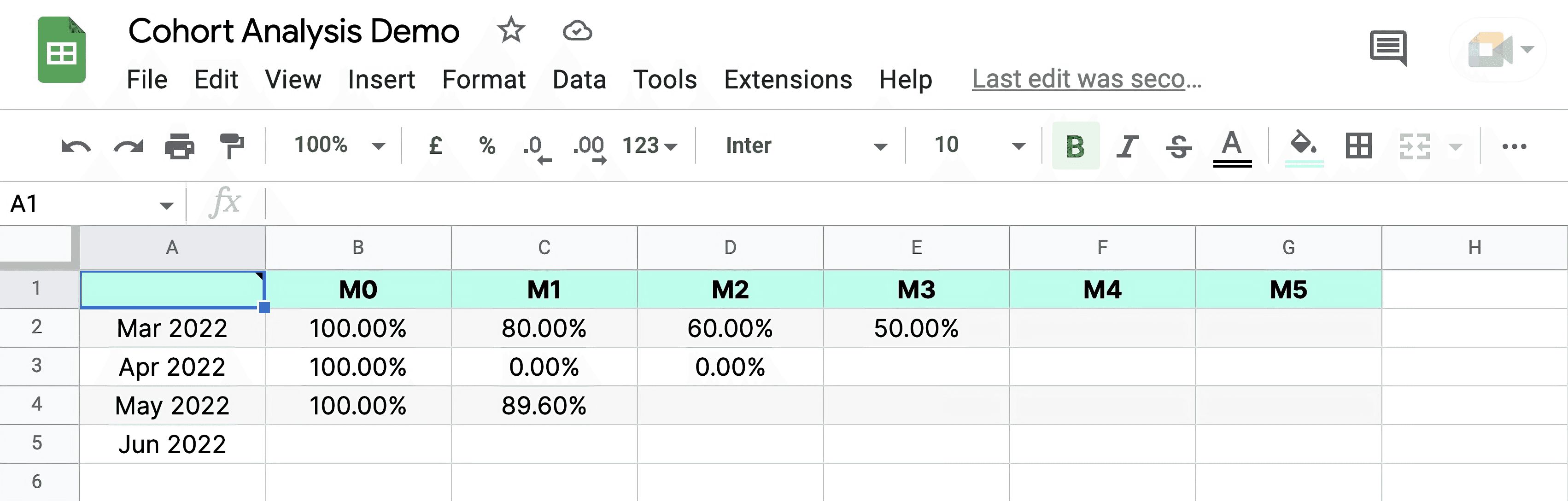
In this example, row 4 shows that out of the customers who were acquired in May 2022 (M0 = 100%), most of them continued as a repeat customer in June 2022 (M1 = 89.6%). This indicates that the customers acquired in May were mostly high quality, highly relevant ones, and continue to find value in your products the next month. The March cohort shows how the rate of returning customers drops over the time period (month), indicating your customers may not find a reason to return to your store over a long period.
Improve your DTC game. Sign up for weekly tips.
Deriving Actionable Insights from Cohort Data
These are some ways you can use cohort analysis reports to derive insights:
Identifying Successful Cohorts
To begin, focus on cohorts that show higher retention rates. This involves analyzing which groups of customers are staying with your business longer. For example, if you find that customers who joined in a particular month have a higher retention rate, investigate what might be special about that period. It could be related to seasonal marketing campaigns or specific promotions.
Understanding Drop-offs
Equally important is identifying where and why retention rates drop. If you notice a trend where many new users or customers tend to leave after a certain period, like the third or fourth month, it's crucial to understand why. This drop-off could be due to various reasons, such as customer service issues or a lack of engaging follow-up communication.
Personalization and Engagement
Analyzing successful cohorts can reveal what keeps these customers engaged. If a high-retention cohort interacts more with specific types of content or promotions, these can be key insights. For instance, if customers retained longer are those who engage with your newsletters, consider enhancing your content strategy in this area.
Product and Service Improvements
Feedback plays a crucial role here. Understanding the product preferences and satisfaction levels across different cohorts can guide improvements. If a particular cohort reports similar issues or preferences, focusing on these areas can enhance their experience and potentially increase their retention.
Customer Experience Optimization
Look into how different cohorts interact with your business. Tailoring the customer journey based on these insights can significantly improve retention. For example, if a specific cohort prefers quick customer service responses, optimizing your support for speedy replies can help retain these customers.
Implementing Changes Based on Cohort Analysis Insights
After identifying key insights from the cohort analysis, the next step is putting those insights into action to improve your business. Here's how you can do that:
Addressing Drop-Off Points
Identify the specific months when retention rates significantly drop. For example, if there's a noticeable decrease in retention during the third month across several cohorts, this period becomes critical for intervention. To counteract this trend, develop targeted strategies like sending personalized emails or special offers to customers before reaching this critical drop-off period.
Enhancing Customer Engagement
Analyze cohorts with high retention rates to understand the factors contributing to their continued engagement. For instance, if these customers are frequently interacting with newsletters or online communities, these elements could be integral in retaining them. Implement similar engagement tactics across other user groups and cohorts, such as introducing more engaging content or community features that have shown effectiveness.
Personalizing Customer Experience
Tailor the customer experience to align with the unique preferences of each cohort. This approach involves understanding what each group values, whether it's product recommendations, efficient customer service, or a streamlined user experience. Based on these insights, refine the full customer lifecycle journey for each cohort, like optimizing customer support for those who value quick responses.
Continuous Product and Service Improvement
Collect and analyze feedback from different cohorts regarding your products and services. Methods like surveys or feedback forms can be effective in understanding the specific preferences and issues of each group. Use this feedback to iteratively improve your offerings. For instance, if a common issue is identified within a cohort, prioritize resolving this issue to prevent future retention losses.
Monitoring and Adjusting
Regularly review the impact of your implemented strategies on retention rates. This could be done on a monthly or quarterly basis to assess how the changes are affecting different cohorts. It's essential to remain agile in your approach, ready to modify strategies based on the ongoing analysis of the data. The ability to adapt quickly is key in effectively responding to the evolving needs and behaviors of your customer base.
Prefer to watch a cohort analysis walkthrough on video instead? Here our cofounder talks through the process of creating and interpreting a cohort analysis on your Shopify data.
Conclusion
Success in enhancing customer retention relies on a deep understanding of specific cohort needs and a willingness to continuously adapt strategies to meet these needs. Regular evaluation and adjustment, informed by cohort analysis insights, are vital for maintaining long-term customer engagement and driving business growth.
Not yet on Airboxr? Try it free for 14 days. Simply enter your business email below.